How to build better slide decks
Let’s start together
While it’s an uncomfortable feeling, it is actually a crucial first step towards building a better slide deck. We need to know that something is wrong before we can identify what is wrong and how to fix it.
Our goal for today is to learn how to build better slide decks. In order to do this, we first need to understand what makes a slide deck good or bad and the impact this has.
What are we going to do?
Today’s goal is to help you understand three key points:
- What do we mean when we say a slide deck is “bad”?
- What is the impact of a “bad” slide deck?
- What specific things make a slide deck “bad”?
First things first—what is a “bad” slide deck?
Whether it is created to be used as a part of a live-presentation, as an independent-study tool, a reference document, or part of a virtual toolbox, all slide decks are essentially collections of information and messages. In the case of the pharma and biotech industries, most slide decks are created to communicate scientific or medical information either internally, to colleagues within the company, or to external stakeholders like HCPs, regulatory boards, patients, and investors. Though the specific goal of slide decks may vary, they are all designed to provide information to a specific audience.
What is a “bad” slide deck then? A “bad” slide deck is one that fails to achieve this goal. Think about it! Communication is only successful if the message or information is received by the audience. If there are gaps in knowledge, misunderstandings, or inaccuracies then the slide deck has failed. This is what makes it “bad.”
What is the impact of a “bad” slide deck?
Bad slide decks can:
- communicate messages incorrectly, leading to costly errors;
- give the audience a bad impression of you, your product, and your company, affecting reputations and credibility; and
- waste the audience’s time.
While there are a few things that obviously make a slide deck “bad,” like missing information or incorrect statements, most of the time it is much harder to identify the specific issues. We often just have a feeling that something isn’t quite right. This feeling comes from the way our brains work.
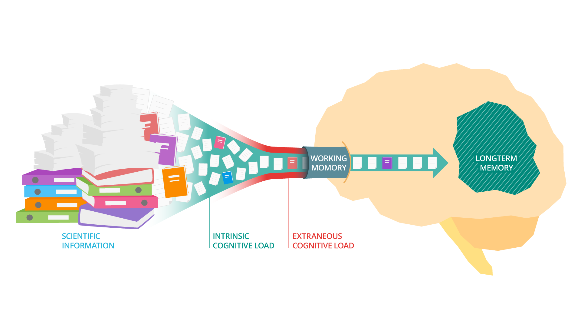
In any situation, all information we are presented with needs to be processed by our working memory before it becomes a part of our long-term memory. The challenge, however, is that the capacity of the working memory is very limited and the information to be processed does not only include the useful information we want to take in but also everything going on in the background.
So what makes a slide deck “bad”?
Educational psychologist John Schweller explained this by dividing the total mental effort of understanding information into two distinct groupings: the mental effort required to understand the content we are dealing with (intrinsic cognitive load) and the mental effort required to understand how the information is presented (extraneous cognitive load). These two types of cognitive load compete for the limited space available in the working memory.
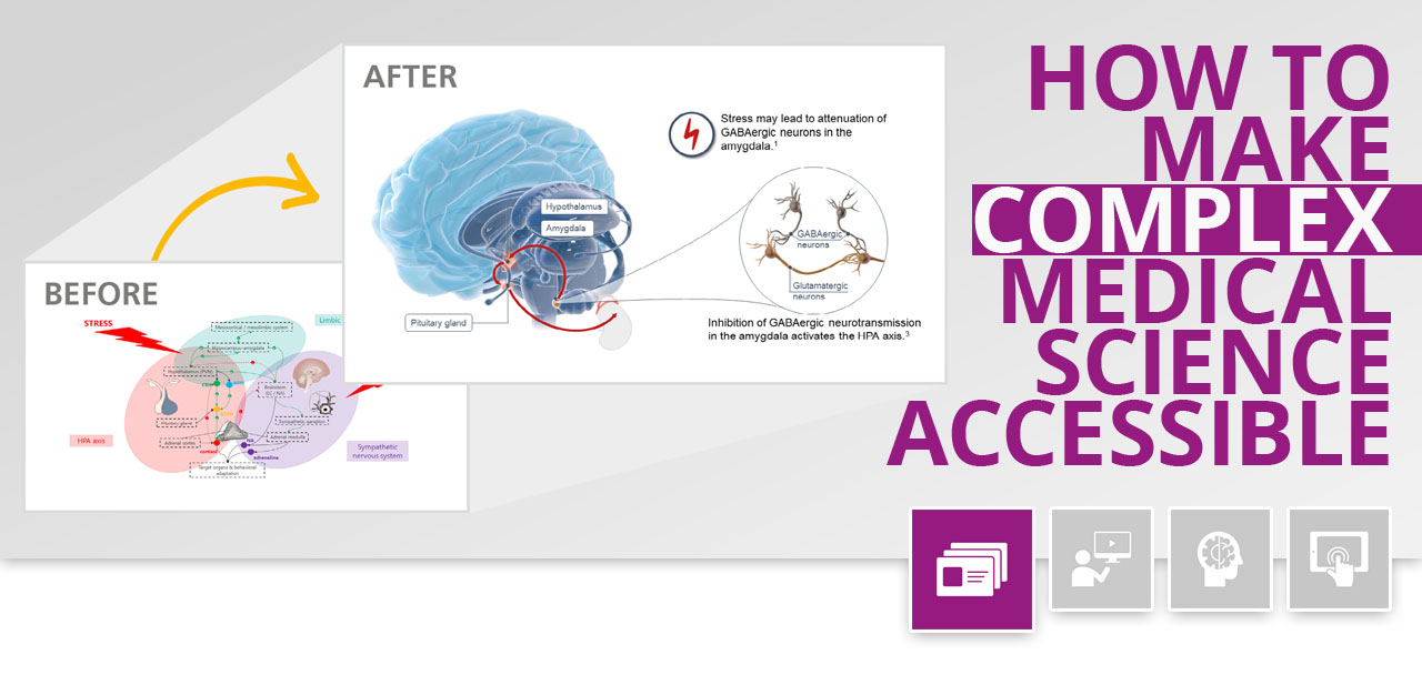
For slide decks, this means things like cluttered design and distracting visuals detract from people’s ability to understand the useful information. When overwhelmed by the extraneous cognitive load, most people will stop investing energy in trying to understand the content and give up on trying to decipher the key message. This is all the more true for scientific information, which has an especially high intrinsic cognitive load. Even the smallest distraction like a term used ambiguously or a font size that’s too small can make you lose your audience.
To be processed by our working memory, information needs to be structured into bite-sized chunks and distractions should be minimized.
Because of this, when creating a slide deck, it is important to:
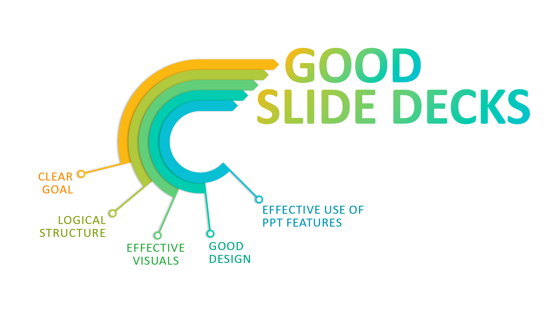
- manage the intrinsic load (the information you want to communicate) by organizing the information into bite-sized chunks, and
- reduce the extraneous load as much as possible by removing unnecessary elements and using a clear design.
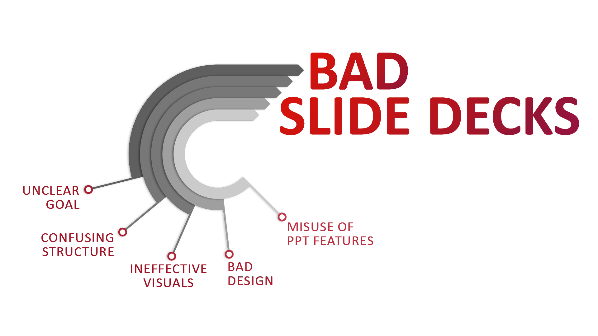
Here are some specific issues we often see, which contribute to a high cognitive load:
- There is no clear objective or overall goal for the slide deck.
- The information is not organized in a structured and logical way.
- The slide deck does not use visuals to support understanding.
- The slide deck does not follow common graphic design rules.
- The slide deck does not take advantage of the full range of PPT features, including animation, transitions, and advanced tools.
How can you objectively asses your slides?
As mentioned, the first step to building a better slide deck is understanding where your current one is going wrong. To help you do this, we have created a checklist, based on the workflow we use at CAST PHARMA, to help you quickly and easily identify issues. While the checklist below is a somewhat simplified version, we will explore each of these areas in more detail in the upcoming editions of this visual storytelling update.
Please take three things away from this article:
- Analyzing your slides in an objective and organized way is the first step to making better slide decks.
- Bad slides have a heavy extraneous cognitive load.
- Improving slides means minimizing the extraneous cognitive load through good design and managing the intrinsic cognitive load with a sound logical structure.


