A practical guide to interactive infographics for medical affairs
Medical affairs teams face a critical challenge: presenting complex scientific data in a way that is engaging without sacrificing credibility. While static infographics have their place, today’s healthcare professionals expect more dynamic experiences. Interactive infographics are transforming scientific communication, from congress booths to Medical Science Liaison meetings.
However, a poor technical approach can lead to compatibility issues and deployment headaches. This guide covers the essential best practices for creating interactive infographics that work effectively in the field.
Balancing credibility and visual impact
In medical communications, a “too polished” design can sometimes undermine the message by feeling more like marketing than science. HCPs are trained to be skeptical, and an understated visual approach can signal that the data speaks for itself.
But at a major medical congress, with hundreds of booths competing for attention, clinical restraint can lead to invisibility. You need visual impact to draw an audience in but scientific credibility to keep them there.
The solution is to match your design to the context. Every visual element either builds or erodes trust. The key is to create impact while maintaining the visual cues that signal scientific rigor.
Choosing your deployment format: a breakdown of options
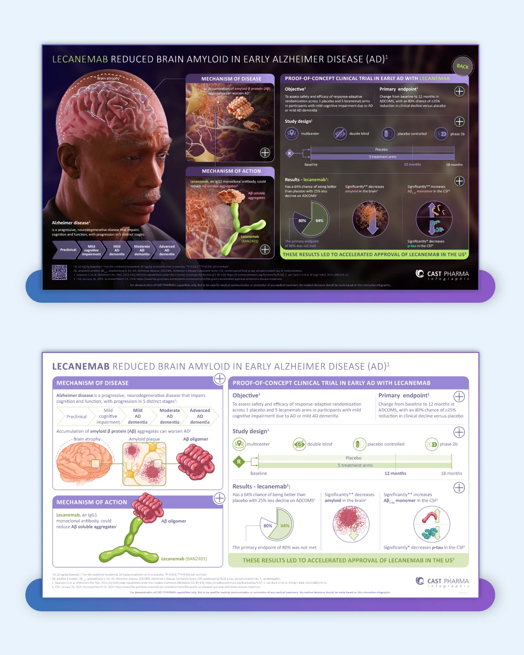
An interactive infographic is an invaluable tool for MSLs, allowing them to tailor scientific discussions to an HCP’s specific interests. But getting that content onto a device like an iPad can be a technical hurdle. We’ve included a live demo for each format so you can try them for yourself. Here are the most common deployment options:
- Interactive PDF: This is often the simplest and most reliable path. PDFs work offline, maintain consistent formatting across all devices, and integrate easily into existing email and file-sharing workflows. For MSLs in the field, they eliminate connectivity concerns.

- Interactive PowerPoint: Surprisingly effective, modern PowerPoint runs natively on most devices without an internet connection. Its Kiosk Mode is perfect for unattended congress booths, allowing user interaction while preventing accidental exits. It is reliable, familiar, and easy for non-technical team members to update.

- Interactive HTML: HTML offers the richest interactivity, supporting complex animations and advanced user interfaces. However, it demands a stable internet connection, which can be unreliable in congress centers, hospitals, or remote locations.

- Mobile-first interactive booklets: These formats are optimized for touchscreens on mobile devices and tablets. They offer streamlined navigation that works well for quick interactions, such as at a congress booth. However, they also demand a stable internet connection.

For large-scale operations, these interactive assets are often managed and deployed through an enterprise platform. The Veeva Medical Suite is a prominent example, functioning like a specialized CRM where approved medical content is hosted and distributed. A platform like Veeva provides a compliant, centralized hub for tracking MSL usage, ensuring version control, and gathering detailed engagement analytics.
Matching the tool to the task
The right technology depends on your team’s needs and constraints, not just what seems most advanced.
- For small to mid-sized teams, start with interactive PDFs or PowerPoint. They are cost-effective, fast to deploy, and easy to manage without specialized IT support.
- For large pharma organizations, enterprise platforms like Veeva are often a necessity. These systems are ideal for deploying Interactive HTML and mobile-first assets, as they can be packaged with SCORM for seamless integration. This provides the detailed engagement analytics needed to measure field effectiveness and justify the investment.
For congress booths, reliability is paramount. A well-designed interactive PowerPoint in Kiosk Mode can be just as engaging as a custom-built app but is far less likely to fail. Simpler formats allow you to tell a compelling story within the short attention spans common at a busy event.
Essential technical considerations
Two often-overlooked details can make or break your project:
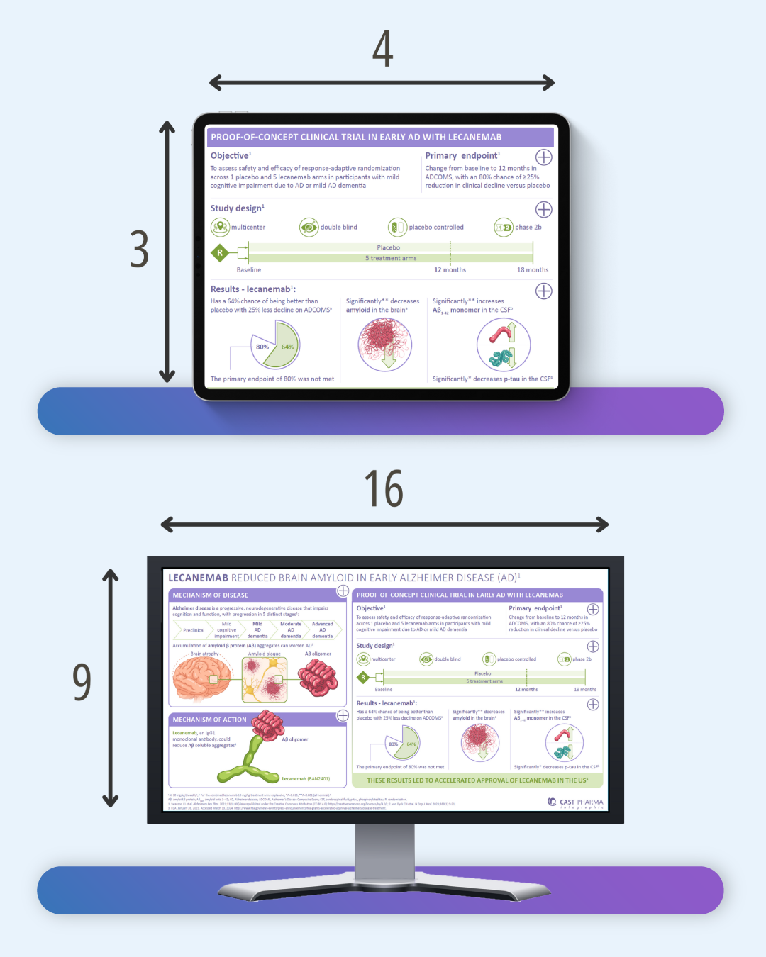
- Device aspect ratios: Most iPads use a 4:3 (squarer) aspect ratio, while most large touchscreens and laptops use a 16:9 (widescreen) ratio. A design created for one will look stretched or have distracting black bars on the other. Define your primary use case first, or design with “safe zones” to ensure critical content is always visible.
- Planning for last-minute updates: Wording or data can change hours before a presentation. PowerPoint’s key advantage is its accessibility; any team member can make rapid updates without needing specialized software or agency support. This flexibility is invaluable for MSLs who need to customize presentations or incorporate new information quickly.
Looking forward
Interactive infographics are essential tools for modern scientific communication. Success isn’t about choosing the flashiest format, but the one that is most reliable, accessible, and suited to your audience.
By balancing thoughtful design with technical pragmatism, medical affairs teams can create powerful communication tools that engage HCPs effectively, whether at a global congress or in a one-on-one meeting.