Slider Stroke Prevention

STROKE PREVENTION IN
ATRIAL FIBRILLATION

Paradigm-changing clinical data explained visually

How we took "dry" clinical data and turned them into an exciting visual application, clearly explaining the paradigm shift with the help of a simple analogy.

Many therapeutic areas are highly competitive, even more so when you are not the first to enter the market. Our client faced exactly that situation but had excellent clinical data with the potential to shift a paradigm in the field of anti-coagulation.
However, the available material was, as so often, neither particularly thrilling for the target group nor at all visually appealing.

Our challenge: Developing an interactive visual tool to make the clinical data more accessible.

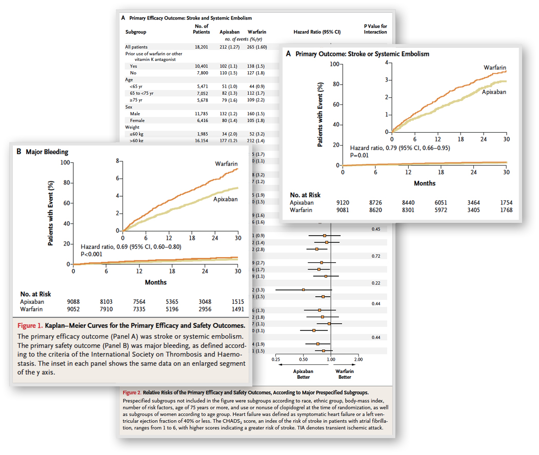
Before: Clinical trials, facts, tables & graphs

BEFORE: Clinical trials, facts, tables & graphs

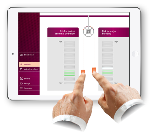
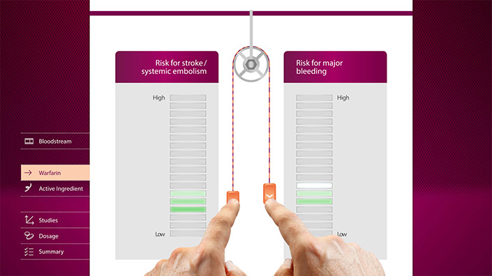
The current paradigm: If you lower the risk of stroke/systemic embolism, then the risk of major bleeding increases.

After: Interactive Presentation

AFTER: An interactive tool

For this client, we developed an interactive application that uses the analogy of a pulley to explain the current paradigm in anti-coagulation: The inhibition of coagulation to prevent the formation of blood clots that can potentially cause a stroke always happens at the expense of an increased risk of bleeding. Replacing the rope of the pulley with a more flexible one rope reflects the unique properties of the novel anti-coagulation drug: While the risk of clot formation is reduced, the risk of bleeding does not increase to the same extent as seen with older anti-coagulation drugs.
With this application, the user can explore the importance of the clinical trial results in a highly interactive and memorable way.

Do you have a project in mind?