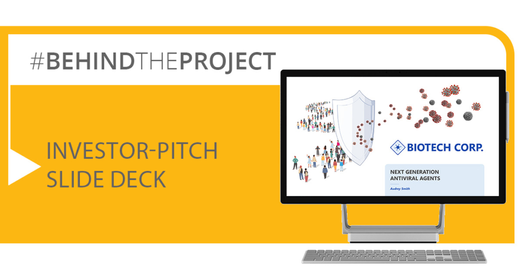
How to create a convincing investor-pitch slide deck
But how to create a sophisticated and visually interesting slide deck that captivates your audience? In the following case study, you’ll find the major pitfalls of developing a pitch presentation for investors and tips on how you can bring your slide deck to the next level.
A typical input slide deck – what are the issues?
The slides we received as input in our example project were intended to be a content overview and contained all the relevant information that was to play a role in the pitch.
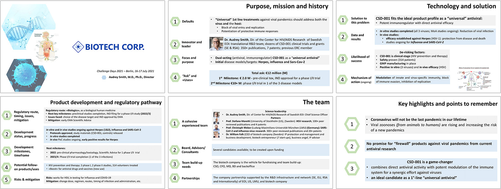
The input slides
After a first review of the slides, we noted the following:
- The slides are very text heavy
- Every slide looks almost the same
- Slide content is structured linearly based on paragraphs and bullets
- Visuals are mostly limited to study data
- Visuals from the internet are used with a watermark (without copyright clearance)
- Design is unattractive and inconsistent
- The key message of each slide is not clear at first glance
The output slide deck – overcoming the issues and creating convincing and visually interesting slides
A sophisticated design and slide layout catches attention, guides the eye through the content of the slide, and even evokes emotions. So our next step is analyzing the design of the investor-pitch slide deck.
The slide master – setting the basis for the slide deck
A design master defines the overall look and feel of the slide deck. The selection of fonts, colors, backgrounds, and shapes of design elements strongly influences how we feel about a presentation. Should it look formal and elegant or playful and fun?
As the slide deck provided by the client had no design master, we developed one from scratch. To create a fresh and convincing investor-pitch slide deck, we took the following points into account when custom-designing the master:
- Design as simple and elegant as possible
- Clean background that does not distract from the slide content
- Color scheme with limited number of colors that harmonize with each other (keeping in mind the emotional feelings that different colors evoke)
- Sans serif font without frills
- Dark grey tone for main copy color
- Limited number of fixed font sizes (one for headlines, one for footnotes, and three at most for the different elements on the slide)
- Fixed positions for headline, footnotes, company logo, and additional elements
One final slide
The visual on the title slide – a strong and meaningful first impression
The title slide is usually on screen a bit longer, as the audience waits for the pitch presentation to start, so we have to seriously consider how it can already impact the audience.
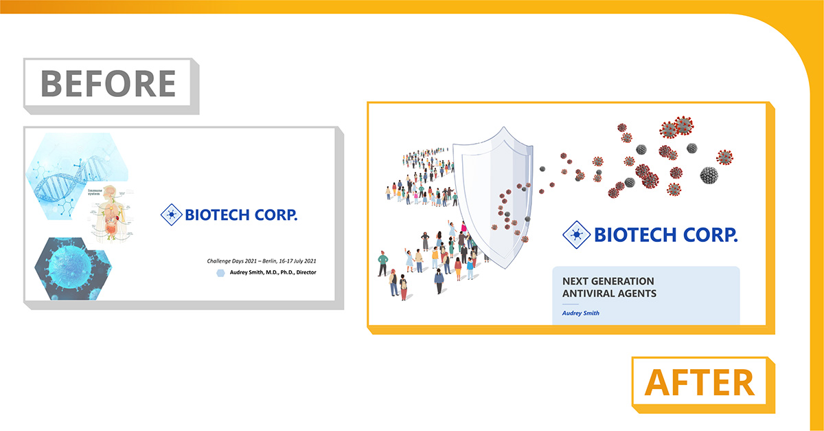
The title slide: client input and final slide
In the input slide deck, the client used random stock images that didn’t match design-wise and had questionable copyrights. To improve the title slide, we created a simple, emotionally evocative analogy using a group of patients and a protective shield against various attacking viruses; this perfectly represents the product’s main characteristic, an anti-viral effect that helps people.
Structure the slide content – making slides accessible for the audience
Structuring text and other elements on each slide based on their meaning was the first step in creating the new concept for this slide deck. A unique layout for each slide was created; drawing the audience through a clear narrative to ensure they could best absorb the content was the main goal.
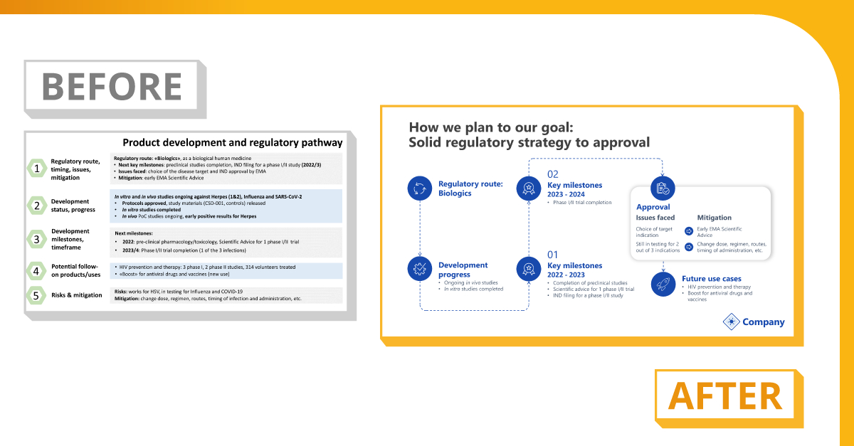
If the content is a timeline, arranging it from left to right and highlighting the most important points is a great way to increase comprehensibility
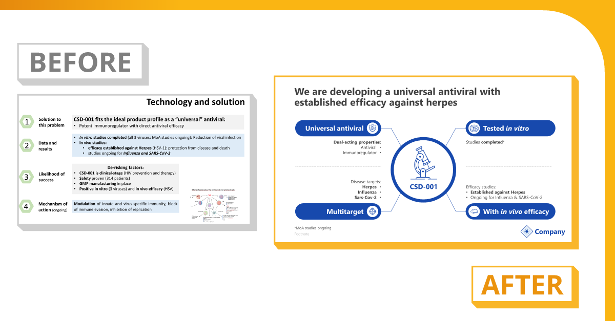
When the content is an overview of product characteristics, icons representing each category and characteristics keeps the eye interested and lets the viewer quickly grasp the essence.
Comparisons, process, a hierarchy, or other relationships can easily be represented by just structuring the text on the slide and adding some simple but dynamic visual elements like boxes, icons, and connecting lines. Notice how contrasting light-on-dark and dark-on-light text makes the information pop, too!
Reduce text on the slide – strengthening the role of the presenter
When we worked on the new slide deck concept, we kept the text on the slides to a minimum in order to make sure the audience follows the presenter instead of trying to read along.
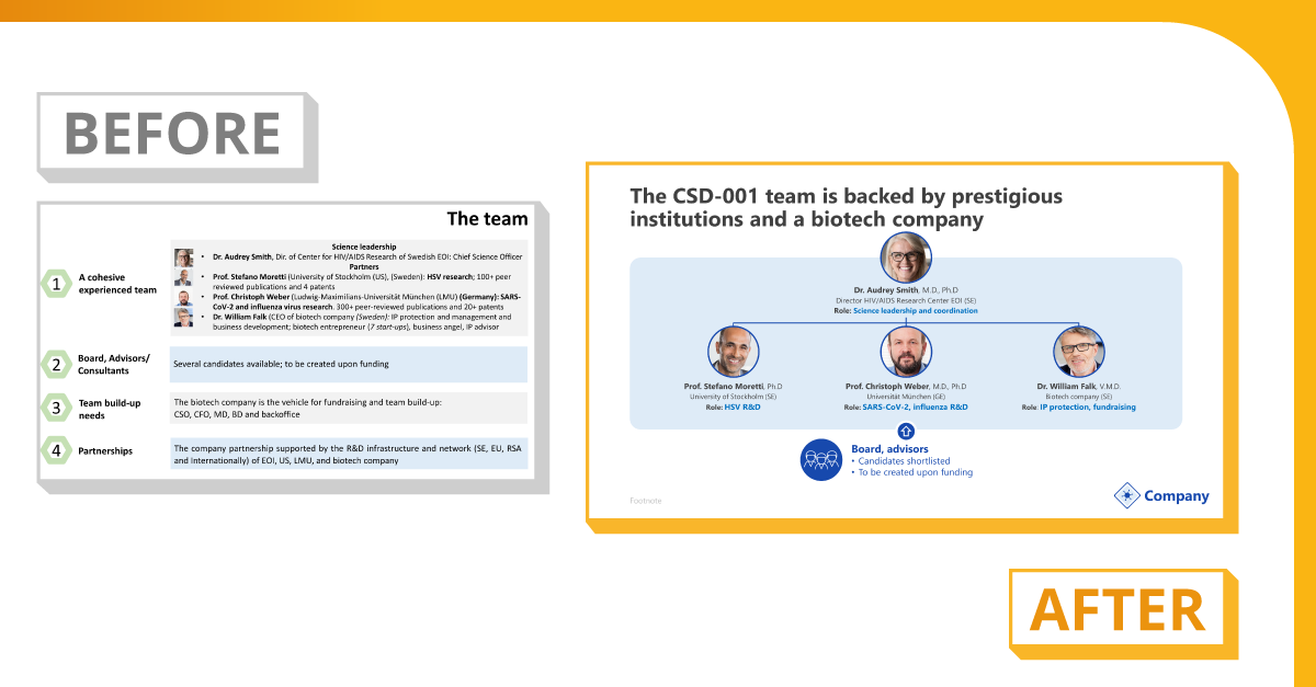
The team overview slide: client input and final slide
Unless a very important statement needed to be emphasized, we only used single words or bullets instead of full sentences. Always keep in mind: the text on the slide is only needed to guide presenter and audience through the presentation, not to tell the whole story in detail.
Meaningful and concise headlines – turning weak headlines into strong key messages
Once each slide’s content was set, we created a key message as a headline that sums it all up. This way, the audience is able to grasp the overall story of the investor-pitch presentation just by reading the headlines of the slide deck.
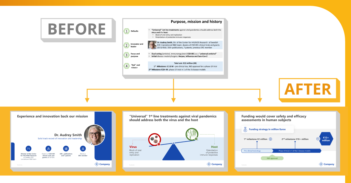
The input slide was split up into three slides with meaningful headlines for each.
Conclusion
This case study shows that there are several “construction sites” in investor-pitch slide decks worth taking a look at. Adjusting design, slide layout, visual approaches, texts, and headlines can strongly improve these slide decks to enhance both usability for the presenter and accessibility for the audience. This can all really improve the chances of your pitch! If you’re interested in the prices for the individual treatment options, download the brochure below!