How slides can be significantly improved with three simple steps
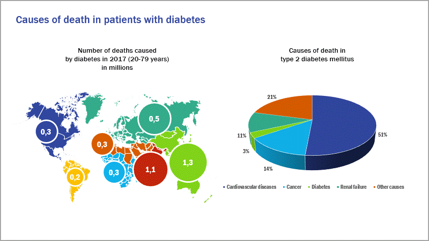
With today’s slides, the “before and after” effect is not immediately obvious, but we still have some tips for their improvement that can be applied to many other cases. Notice that the initial slide uses the same colors for both the left and right infographics. This is misleading for the viewer, because the representations actually have nothing to do with each other.

Input material provided
What can be done?
To avoid confusion and allow for greater focus, we split the information into two slides. The titles of the slides present meaningful key messages. We also noticed that the number of deaths caused by diabetes is significant, but the presentation of the numbers in the initial slide does not accurately reflect the threat. The simple solution here is writing out the numbers. The use of 3D pie charts is not recommended for scientific representations because they can distort the percentage values. We therefore rely on a flat 2D representation that visually emphasizes the actual core statement.