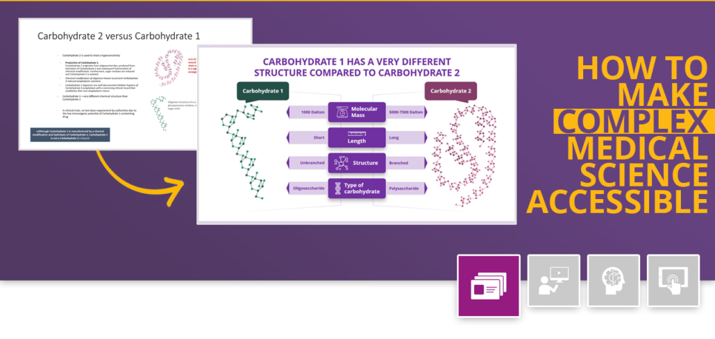
How a clear structure helps to achieve a precise comparison
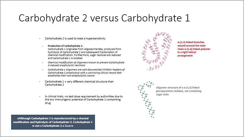
Today’s slide compares two carbohydrate structures used to formulate iron-replacement therapies. The original slide gives a lot of information on the differences between the two structures and what that means, but there is no clear graphic structure showing a comparison.
Instead, important key aspects are buried in a long text block. The headline is vague and seems to leaves the analysis to the viewer.

Input material provided
So what can be done?
We rearranged the slide into a table format that allows for a clear comparison. The informative headline gives the table context, and structuring the text into categories lets the viewer contrast the two structures side by side. Each category is associated with a small icon, which aids understanding and retention. The text was purposefully shortened and simplified so that the viewer would not be overwhelmed.