Engaging eLearning tools with a fresh editorial design
Every day, employees working in medical affairs use high-quality apps and read interactive digital publications with a sleek and clean design. They do all of this after they get home from work. And the next day the same employees go to work and sit in front of boring slides to learn information crucial for their profession. How design can engage or derail an eLearning.
What is editorial design?
Editorial design is a term that comes from print media—newspapers, journals, and magazines. As media has transitioned over the course of the last century from print to film to television and more recently to digital formats, editorial design has taken on new meanings. However, the role is by and large the same:
capture the attention of the audience and make information easier to understand.
In fact, this role has become increasingly important given the flood of available media all competing for the audience’s attention.
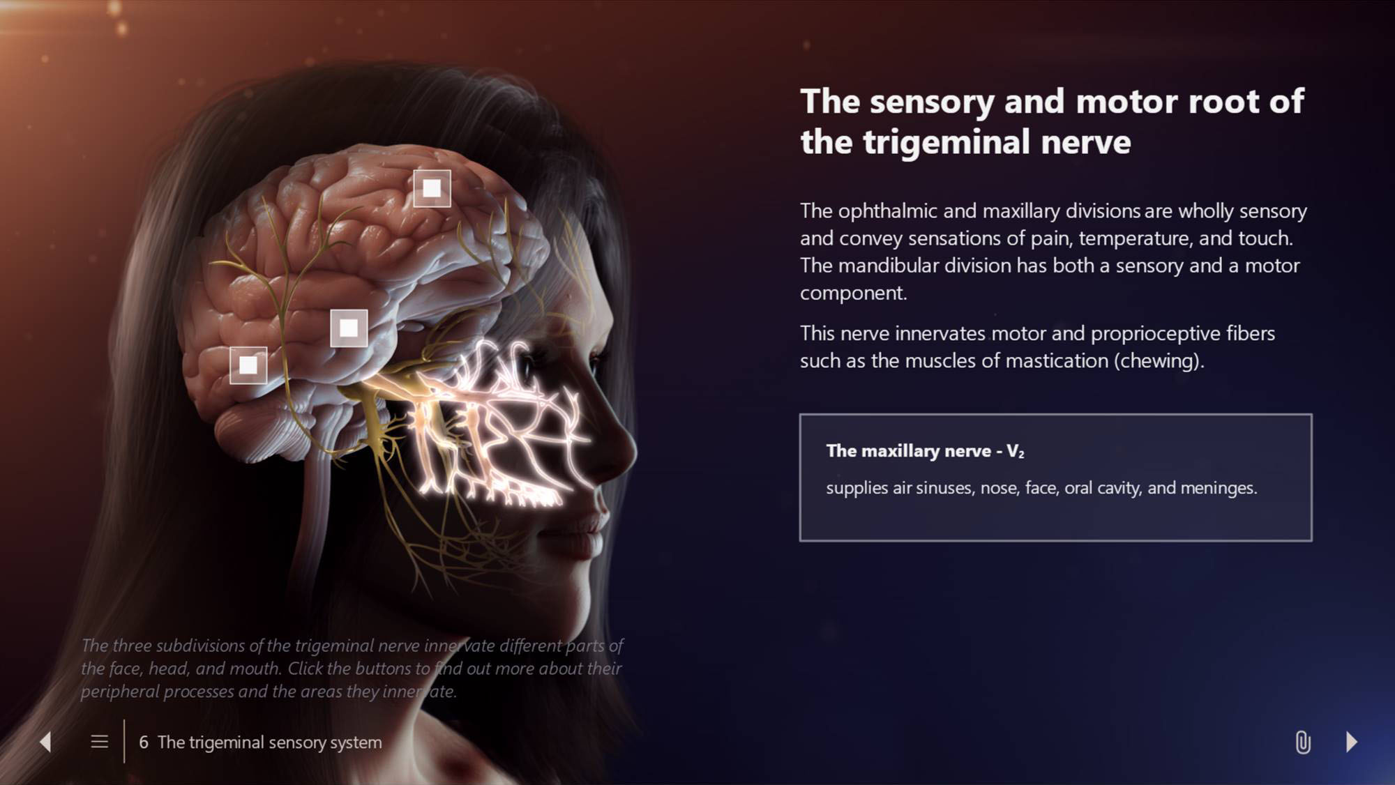
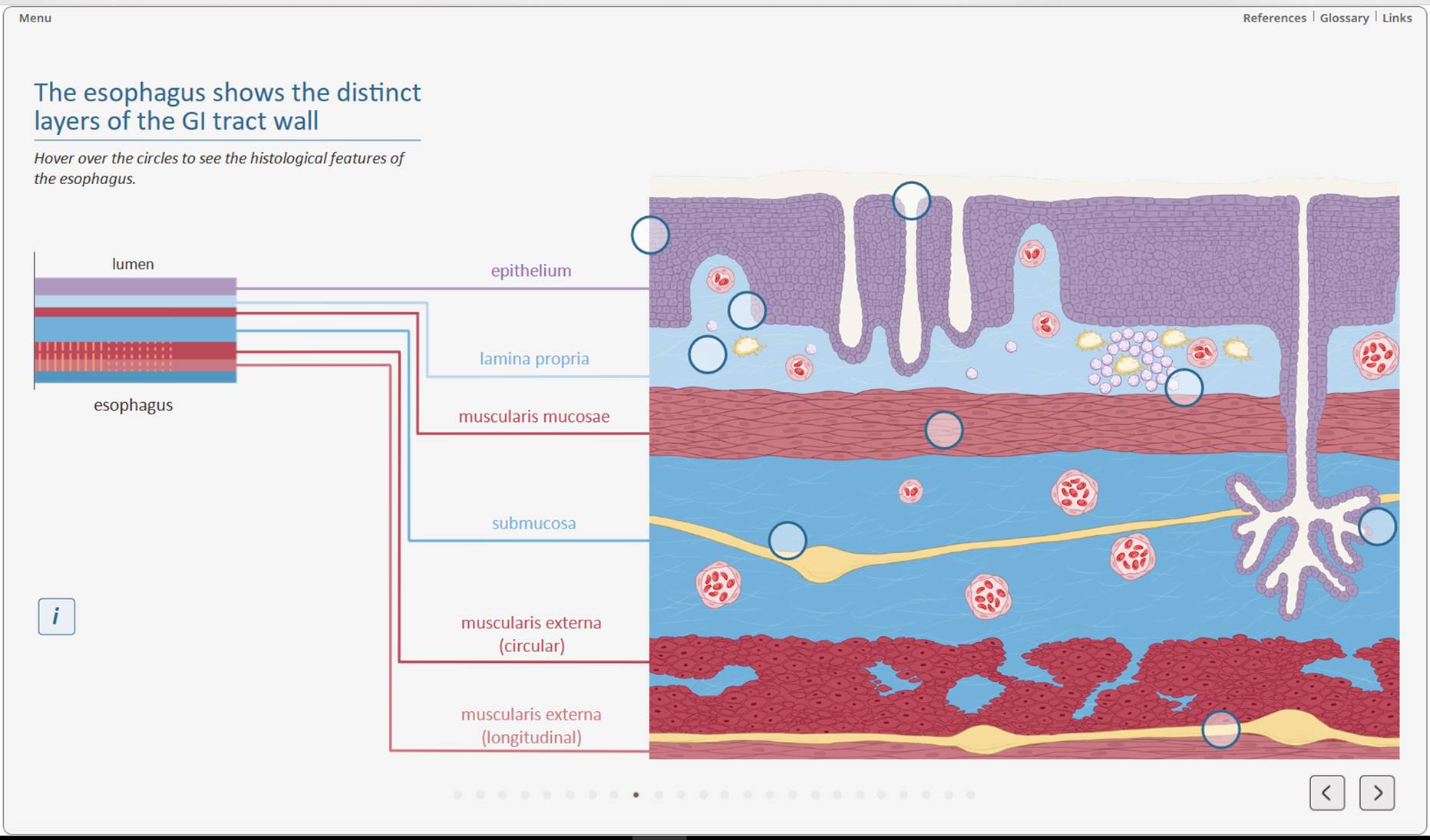
Editorial design does not only include the use of visuals, but the right combination of visuals and text and the layout on the page. Good editorial design controls the eye’s movement across the page or screen from impressive visuals, over the most important text and then to additional information. The layout with different text blocks provides several reading entry points. When using digital media, editorial design can also include interactive elements, such as clicking on buttons to open text boxes that explain specific parts of a visual.
Editorial design for eLearning tools that captivate and motivate
Editorial design is also a powerful tool for the design of an eLearning. A visual approach verifiably leads to more successful learning compared to text alone. Editorial design serves the reading habits of the target audience, motivates the learners and makes the content memorable. In eLearning tools, the first task of design is to convey information. But as design also evokes emotions, it needs to be attractive and appealing.
One eLearning slide contains several elements that are arranged in a specific layout. The elements used aside from the visual and the headline need to be chosen according to the specific content. However, the overall look and the layout needs to be consistent throughout the entire eLearning tool.
The visual element captures attention and contains the main information. It can be a picture (with labels), an image sequence, an interactive diagram, an interactive infographic, a video/animation sequence, or a game. The caption contextualizes the information in the visual if necessary.
The second element to be noticed is usually the headline. The headline describes the take-home message in a short sentence.
The copy (or main text) describes how the information fits into the overarching story but does not repeat the visual. It should be as short as possible and directly address the learner.
Interactive elements prevent overload and discourage showing too much text at once.
For example, a slide containing just the headline, visual, and navigation instructions can appear first before the learner clicks on buttons to access additional information they need. In this way, learners can choose individually to access information that they need to learn and leave out topics which they are already familiar with. This means they are not staring at the screen and passively consuming the content. Instead, they are actively learning and paying close attention to the material they need to learn.
Additional textboxes can be used to outsource specific topics (definitions, history, examples etc.). This structures the text and provides additional reading entry points.
The control elements are buttons that allow the user to navigate to the next and previous pages and can also contain a progress indicator. They need to have a restrained design to not distract from the content.
Using the right combination of these elements, editorial design is a great basis for developing engaging eLearning tools.


