From cluttered to clear: case studies in strategic slide design
You’ve seen it before: a slide that contains all the right information but somehow fails to communicate effectively. Whether it’s part of a training deck, an eLearning module, congress materials, or live presentation, the content is accurate and complete—so why doesn’t it work? Most content failures aren’t about missing information. They’re about poor communication design. In medical affairs, where slides serve multiple purposes—from educating field teams to supporting HCP conversations to documenting clinical evidence—this distinction becomes critical.
The challenge often lies in recognizing what separates slides that merely contain information from those that actually communicate it effectively. Whether your audience is reviewing materials independently, participating in training sessions, or referencing content during patient discussions, clear patterns emerge in what works—and what doesn’t.
Understanding these patterns can help any medical affairs professional improve their materials across all formats.
The four-step approach to slide improvement
Step 1: Analyze the existing content
Identify what’s working and what’s creating cognitive friction for your audience.
Step 2: Restructure information flow
Reorganize content hierarchy to match how people actually process complex data.
Step 3: Apply strategic visual design
Make deliberate visual choices that reduce noise and amplify key messages.
Step 4: Test for clarity
Ensure every element serves the communication goal.
This process consistently turns information overload into audience impact.
Case 1: Same data, different audiences

The challenge: A pharmaceutical team started with a basic slide presenting Parkinson’s disease epidemiology as a simple list of bullet points. The slide contained important data—1.2 million Europeans with Parkinson’s, country-specific patient numbers, age demographics, and diagnostic gaps—but the text-heavy format made it difficult for any audience to quickly grasp the scale and significance of the disease burden.
The solution: Rather than creating one “compromise” slide, the team developed two distinct versions using the same epidemiological data:
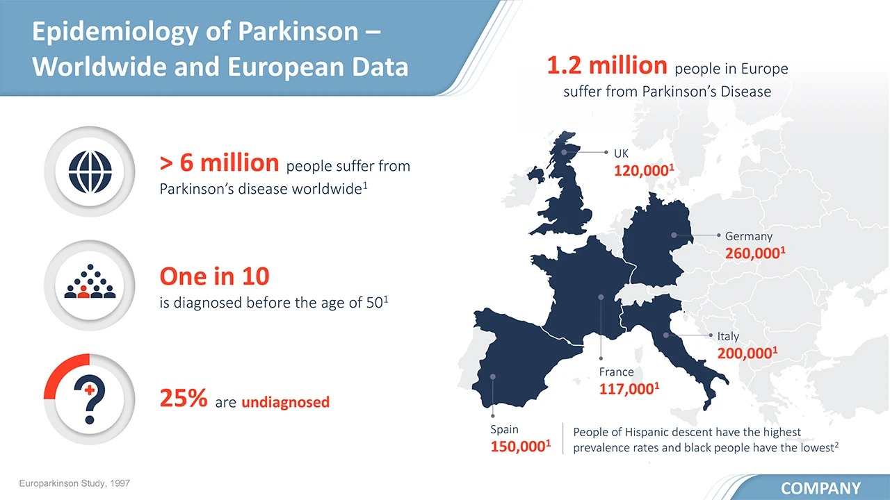
- Medical version: A clean, professional infographic emphasizing clinical relevance through a European map visualization, clear statistical presentation, and straightforward iconography. The design prioritized data accuracy and easy reference during clinical discussions.
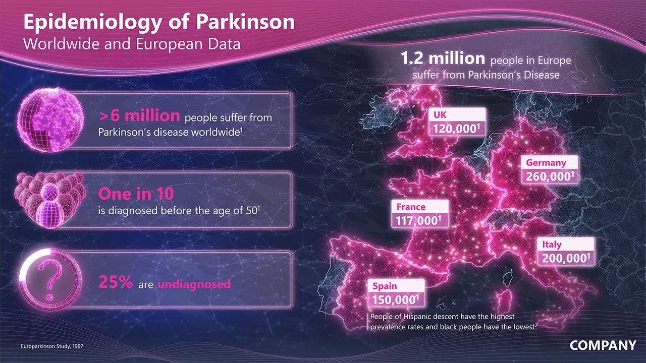
- Commercial version: A visually striking presentation using neurological brain network imagery and sophisticated color gradients. This version emphasized the serious neurological nature of Parkinson’s while making the market opportunity immediately apparent through dramatic visual impact.
The impact: Instead of forcing both audiences to extract relevant information from basic bullet points, each group received a version optimized for their decision-making context. Medical teams could quickly reference clean, clinical data during patient discussions, while commercial stakeholders received a memorable presentation that conveyed both the disease gravity and market scale effectively. Both versions maintained identical factual accuracy while serving completely different communication purposes.
Case 2: Fixing misleading visual logic
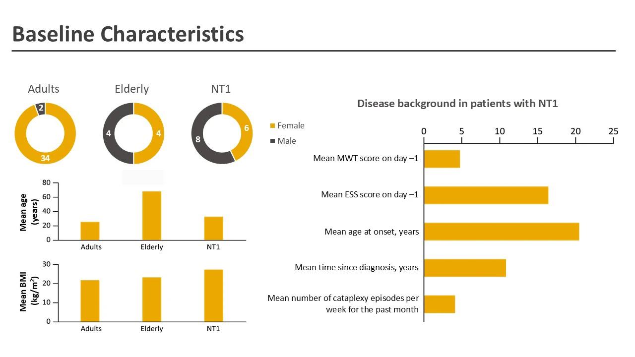
The challenge: A clinical study slide presenting baseline characteristics looked professional at first glance—it contained pie charts, bar graphs, and numerical data. However, closer examination revealed fundamental communication problems that made it difficult for readers to extract meaningful comparisons between participant groups (Adults, Elderly, and NT1 patients).
Specific problems identified:
- Missing structure: No clear grouping made it hard to compare across the three participant populations
- Misleading color coding: Yellow coloring suggested all yellow elements represented female participants, which wasn’t the case
- Inappropriate chart types: Pie charts prevented easy comparison of participant numbers across groups
- Mixed units confusion: The disease background section combined values with different measurement units on the same scale
The solution: The slide was completely restructured using strategic visual organization:
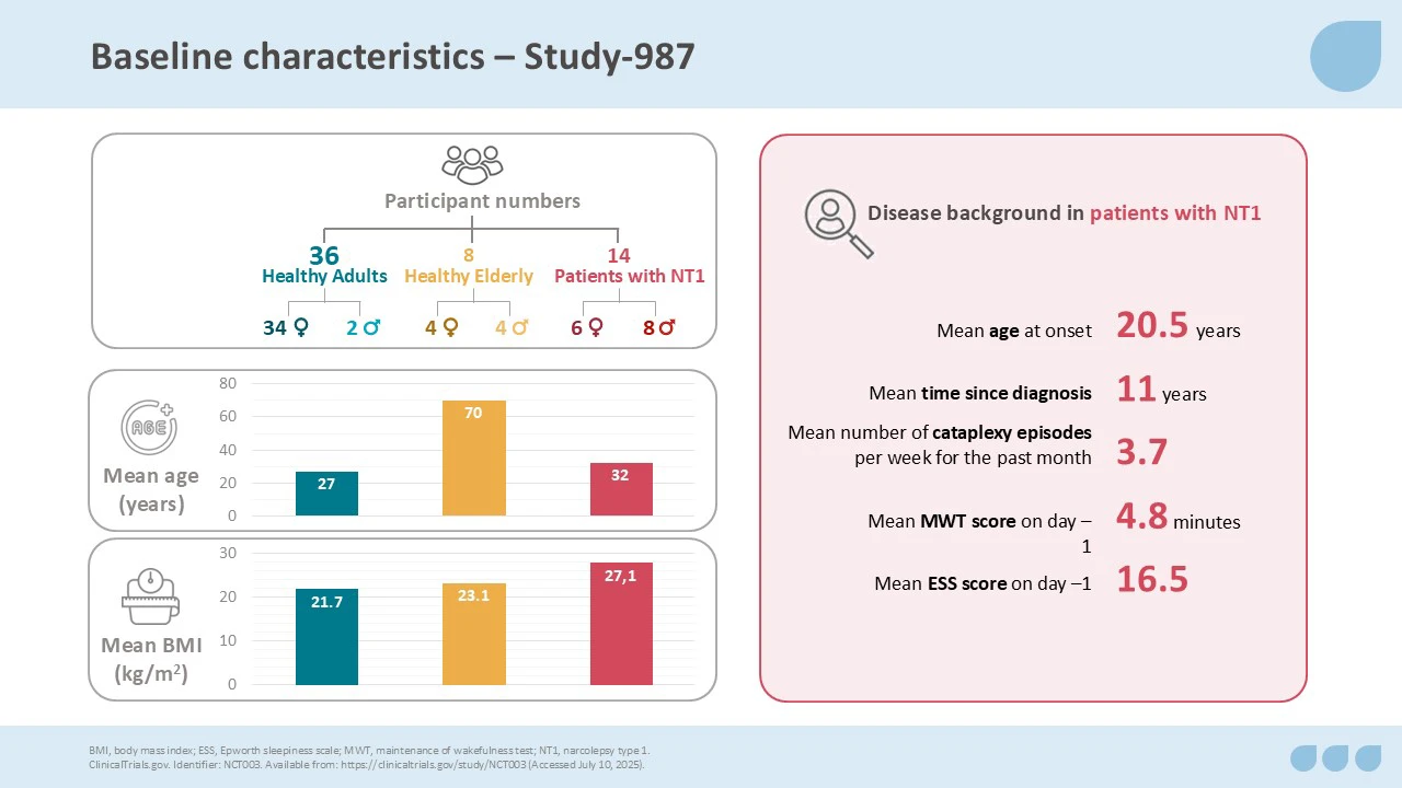
- Clear participant grouping: Related data elements were clustered together with consistent color coding for each population group
- Appropriate visualizations: Pie charts were replaced with formats that allowed direct comparison
- Logical information architecture: Visual elements were added to guide readers through the data hierarchy
- Consistent visual language: Color coding now clearly distinguished the three participant groups throughout all charts
The impact: What previously required careful study and mental translation became immediately clear. Medical professionals could quickly identify key demographic and clinical differences between study populations, enabling faster analysis and more confident decision-making during clinical discussions.
Case 3: Making research findings accessible
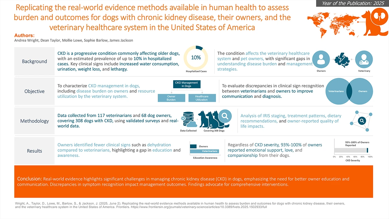
The challenge: A comprehensive veterinary study on chronic kidney disease (CKD) in dogs contained valuable research comparing clinical sign recognition between dog owners and veterinarians. However, the slide presented this important epidemiological data in a dense, text-heavy format with multiple competing visual elements and inconsistent iconography that made it difficult to quickly grasp the key insights.
The solution:

- Clear visual separation: Distinct colors and consistent iconography differentiated between veterinarians and dog owners throughout
- Strategic visual hierarchy: Icons and diagrams were used purposefully to reinforce the emotional connection between dogs and owners (central to the study’s findings)
- Improved information grouping: Related data points were clustered together using proximity principles
- Streamlined content structure: Bullet points and bold formatting created clear pathways through the research narrative
The impact: The emotional and behavioral dimension of the research—previously lost in dense text—became immediately apparent. The slide now told the story visually before audiences read a single word.
Case 4: From definition to understanding
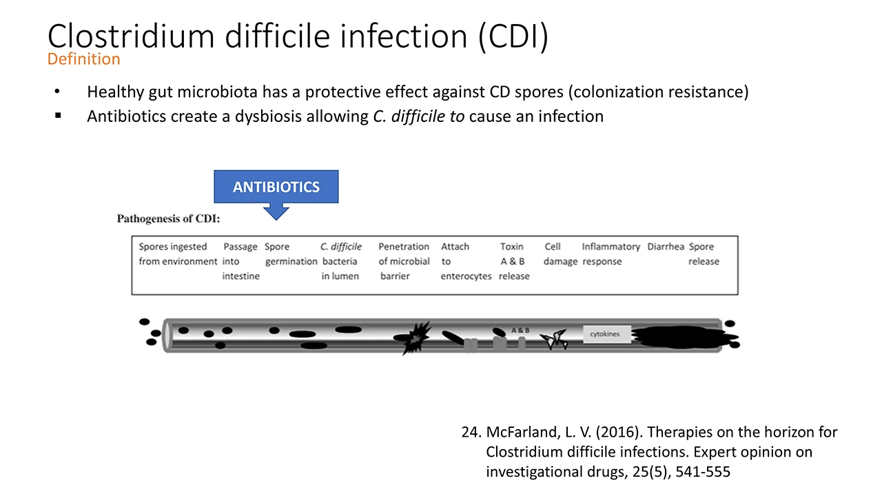
The challenge: A technical slide defining Clostridium difficile infection (CDI) presented the pathogenesis as a linear text-heavy explanation with a basic flow diagram. While medically accurate, it read like a textbook excerpt and failed to help the target audience visualize the actual disease process in anatomical context.
The solution:

The slide was completely reconceptualized using anatomical context as the foundation. Dense clinical text was converted into a visually guided journey through the digestive system, featuring:
- Anatomical framework: A clear digestive system diagram providing spatial context for the infection process
- Sequential numbering: An 11-step numbered sequence guiding viewers through the pathogenesis chronologically
- Strategic color coding: Consistent theming throughout, with color variations distinguishing strategic stages and components
- Visual process flow: Icons and visual elements that reinforced each step of the bacterial infection and inflammatory response
The impact: The target audience could immediately understand not just what happens during CDI, but where and how it progresses through the body. The complex pathogenesis became a clear visual narrative, enabling faster comprehension and better retention for clinical application.
Case 5: Connecting the dots with data

The challenge: A table showing different ulcerative colitis cohorts with no clear timeline or relationship between groups.
The solution:

- Chronological restructuring: Information was reorganized chronologically, with the oldest cohorts at the top and the newest at the bottom.
- Removal of decorative elements: Elements that added no communication value were removed.
- Distinct cohort color-coding: Unique, bold colors were assigned to each cohort.
- Visual relationship connectors: Clear visual lines showed the relationships between timeframes.
The impact: Confusing data became a clear narrative. Audience members could instantly understand the progression and relationship between different patient groups.
Case 6: When less truly is more
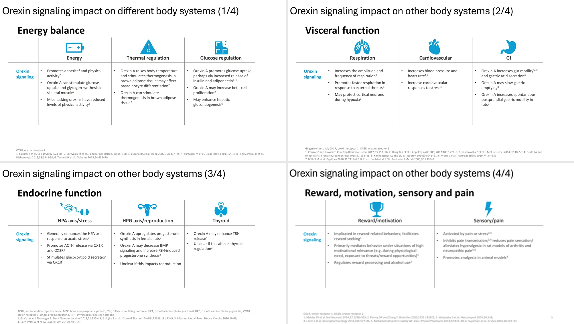
The challenge: A comprehensive overview of orexin signaling’s impact on different body systems was presented across four separate slides, each covering different physiological functions (energy balance, visceral functions, endocrine functions, and neurological/behavioral functions). While each slide was well-designed with clean layouts and appropriate icons, the multi-slide format created several problems:
- Excessive cognitive load: Four slides demanded too much attention for supporting information
- Narrative disruption: The topic’s importance in the overall presentation didn’t justify the extended focus
- Decorative elements: Icons were visually appealing but provided no functional communication benefit
- Fragmented understanding: Related information was scattered across multiple slides, making it harder to see the complete picture
The solution: All essential information was condensed into a single, well-structured slide using strategic information architecture:

- Pyramid principle: Information was hierarchically organized from general concept to specific details
- Visual structure without decoration: Layout, color coding, connecting lines, and font hierarchy guided attention effectively
- Functional design elements: Every visual element served a communication purpose rather than decoration
- Comprehensive overview: All four physiological systems were presented in one coherent framework
The impact: One clean, focused slide replaced four that were competing for attention in the broader presentation. The consolidated approach allowed audiences to quickly grasp orexin’s wide-ranging physiological effects while maintaining appropriate emphasis within the overall narrative.
Key principles that drive results
These examples share common elements: they’re not about adding more visual elements or making slides “prettier.” They demonstrate strategic communication design—removing barriers between your audience and your message.
In medical affairs, this approach becomes exponentially important. Your audience processes dozens, sometimes hundreds, of data-heavy visuals. Every unnecessary cognitive step accumulates into mental fatigue. Every unclear hierarchy creates decision delays. Every confusing visualization erodes trust in your content.
The encouraging news: small, strategic changes create disproportionate impact. A clear information hierarchy, consistent visual language, and reduced cognitive load can fundamentally change how your audience receives and acts on your information.
Applying these insights
These improvements didn’t happen by accident. They result from understanding both content and audience, then making strategic design choices that serve both. Whether you’re working with an agency or developing slides internally, the same principles apply:
- Analyze what’s creating confusion before adding new elements
- Structure information to match how your audience processes data
- Use visual hierarchy to guide attention deliberately
- Test whether every element serves your communication goal
The goal isn’t perfection—it’s clarity that drives action. In scientific communication, that distinction makes all the difference between information that sits in presentations and insights that influence decisions.