How simple infographics can add value to your presentation
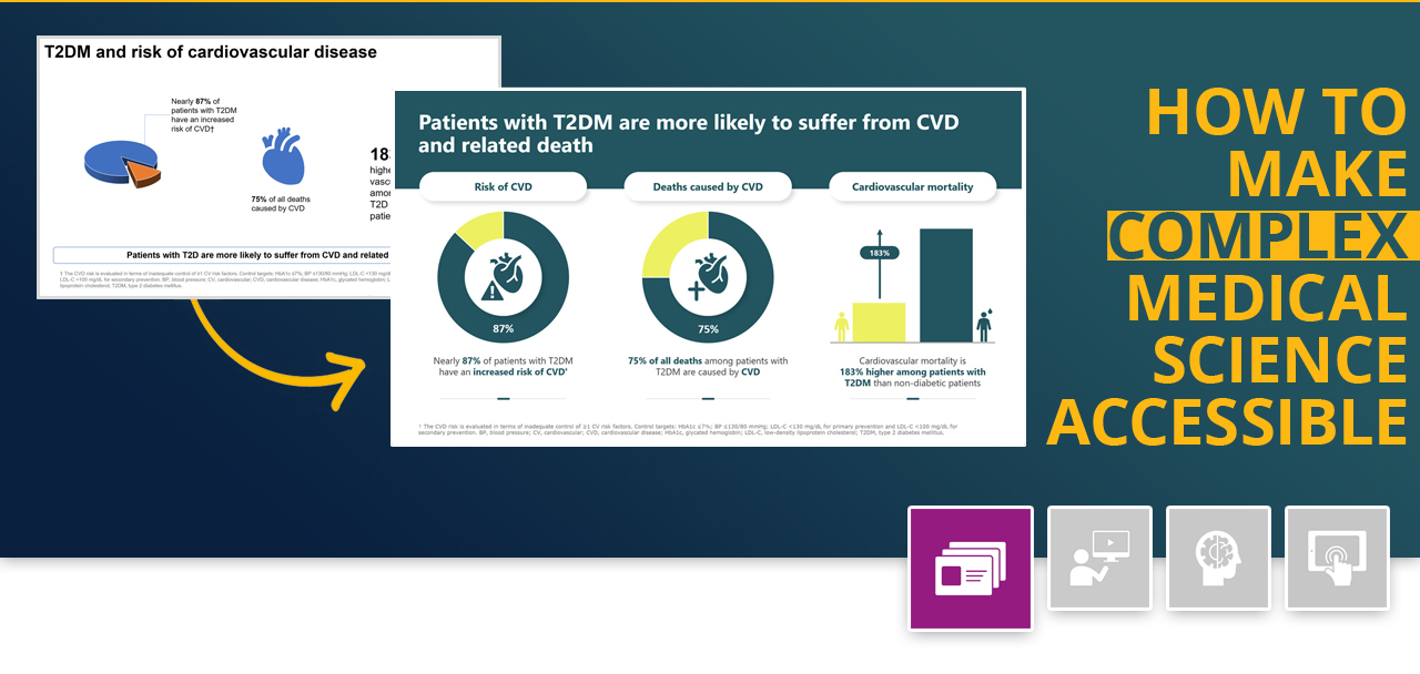
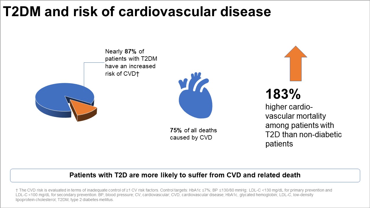
Today’s slide illustrates how simple infographics in combination with precise statements can add value to your presentation. The original slide shows a clear gap between visuals and texts: the visuals fail to support the content, misdirect the viewer’s focus, and are even misleading.
The slide’s title is vague, and the key message is nearly lost at the bottom. Formatting errors and inconsistencies spoil the slide’s structure and alignment.
Input material provided
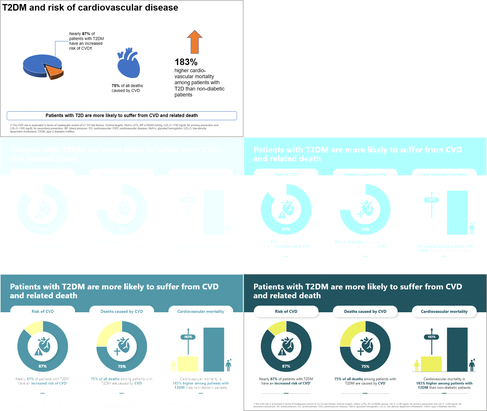
So what can be done?
Our simple infographics fully support the statements and accurately reflect data. We moved the key message to the slide’s title and added subtitles for better structure and alignment. We used consistent formatting, full sentences instead of sentence fragments, and parallel alignment of images and text elements. This lets the viewer understand the slide’s message faster and better.


